Numbers soothe our confidence. In a world full of uncertainties, Statistics provide us with reassuring insights, soothing our cerebral cortex: consumer surveys give us a scientific view of our customers, big data sheds light on consumer relationships, and Google Analytics presents a clear picture of what’s happening on our website.
Not quite so.
Data Analysis Pitfalls: The Human Problem at the Core
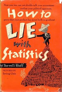
In 1954, the American journalist and publicist Darrell Huff released one of the most popular statistics books in the world, titled “How to Lie with Statistics.” Pay attention to the nuance: it’s not statistics that lie, but rather what we do with them.
In this regard, not much has changed in the past 69 years: statistics continues to deceive us. I’m not referring to vested interests distorting numbers or graphs intentionally, nor am I referring to careless professionals making mistakes in their calculations or technical analyses. I want to focus on three basic mistakes in data analysis that stem from our human nature, and ways to avoid them.
Is Ice Cream Good for a Diet? The Fallacy Beyond Numbers
One of the fundamental insights in the world of data analysis is that correlation and
causation are not the same thing. Our human nature seeks connections and relationships. Therefore, when we are exposed to two similar graphs, we immediately try to link them together. The problem is that the mere similarity between graphs or numbers does not teach us that there is a causal relationship between them. The most famous example in this context is the statistical analysis of ice cream consumption.
A careless statistical study could lead to the conclusion that ice cream consumption causes an increase in violent crimes, but on the other hand, it is excellent for a diet. How can we arrive at such misleading conclusions based on seemingly reliable numbers? It’s simple: correlation is not causation. Indeed, the graph showing an increase in violent crimes nearly overlaps with the graph showing an increase in ice cream sales. However, the reason behind this is not ice cream consumption but a third factor – summer. Traditionally, violent crime rates tend to rise in summer months for various reasons. As a natural consequence, ice cream sales also increase during the summer months. There is correlation, but no causation.
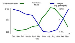
The same applies to the graph showing a decrease in weight during the summer months. It is completely opposite to the graph of increased ice cream sales in the summer. However, the reason behind it is not that ice cream causes weight loss, but rather that people tend to shed the excess weight they gained during winter months in the summer. This happens despite the consumption of ice cream, not because of it.
The conclusion is that after collecting data that provides an overview of “what is happening,” the questions you need to ask are those of “why it is happening”. For example, if you identify a statistical jump in homemade bread sales alongside a statistical decline in suitcase purchases during the same period, you might infer a trend of cozy domesticity taking over the world. Actually, those numbers indicate that what is taking over the world is COVID-19.
Be Sherlock Holmes: Always ask why.
Don’t agree with yourselves: Data can be interpreted in many ways
“What the human being is best at doing is interpreting all new information so that their prior conclusions remain intact”. This statement comes from Warren Buffett, the renowned investor, a man full of humor and sharp insights (my personal favorite quote: “Invest in a business any idiot can run because, sooner or later, one will”). The phenomenon of interpreting data in a way that aligns with our existing beliefs is known as “confirmation bias” in the theory of decision-making. Unfortunately, we are inclined to support our own opinions, and it takes a high threshold of data and facts to shift us from our positions.
The phenomenon of confirmation bias can be observed in the media and social networks, even in today’s times. No matter which graph or table related to COVID-19 treatment is presented to internet users, those who believe that Israel’s handling of the crisis is flawed will interpret the graph as evidence supporting their view, while those who believe that Israel is managing the situation well will interpret the same graph as supportive of their opinion.
The same phenomenon occurs when analyzing data. You have a system of beliefs and opinions about the current situation, and when the data flows, you don’t truly approach it with an objective mindset (even if consciously you are confident that you do). The broader the dataset, the higher the risk of confirmation bias because, unconsciously, you can cherry-pick the data that confirms your initial beliefs and ignore the data that tells a different story.
It is important to be aware of this bias and consciously strive for objectivity when interpreting data. Question your own assumptions, challenge your preconceived notions, and seek a comprehensive understanding of the information at hand. By doing so, you can avoid falling into the trap of confirmation bias and arrive at more accurate and insightful conclusions.

One of the lessons learned from the pre-Yom Kippur War intelligence failure was the establishment of the “ Eipcha Mistabra ” (a term originating from Talmudic discourse and roughly translates to “on the contrary, it would seem”) department in the IDF’s intelligence unit. Its role was to challenge prevailing opinions and provide alternative interpretations of the situation. This is exactly what happened regarding the identification of the Syrian nuclear threat, as revealed by journalist Amit Segal: It was the persistence of several members of the Knesset (led by philosopher Dr. Yuval Steinitz) in presenting alternative viewpoints to the prevailing consensus in the security establishment that led to the exposure of the nuclear facility in Syria.
Be a Buddha. Cast doubt on everything, including your own beliefs.
The data may be solid, but the future is not
The business world is filled with examples of companies that relied on solid data but suddenly found themselves disrupted. The most famous example is Apple’s iPhone. During that time, dominant companies in the market like Ericsson and Nokia, as well as young startups (such as Israeli startup Modu), focused on developing phones based on what the data showed the public wanted: small-sized phones at competitive prices (and phones with multiple buttons for convenient email typing). This highlights the nature of data—it tells us what is happening in the present and the current trends when comparing the present to the past.

Apple’s approach with the iPhone indeed contradicted the conventional wisdom derived from data. They developed an expensive, larger-sized phone without physical buttons. No data could have predicted that customers would be willing to pay a significantly higher price for a revolutionary device that defied their preconceived notions, even if it barely fit in their pockets and lacked traditional buttons.
It is true that data can partially predict the future by identifying seasonal fluctuations or global economic trends. However, data alone cannot foresee what will come next. Furthermore, data can hinder organizational innovation. Nokia, for example, had the technological advantage to surpass Apple, and some argue that it did, but marketing data hindered them from producing phones that, according to the data, no one would buy. There was also no data to suggest that consumers would pay exorbitant prices for a small can of sugar-loaded beverage with a controversial taste and claims to give you wings.
Be Jules Verne : Data cannot reveal futures. Maybe you can.
Summary: Data is a powerful tool – use it wisely
I am a data enthusiast. Data is a sophisticated and unique material for weaving stories, discovering marketing insights, and understanding consumer behavior. There is no doubt that data has become a vital asset in today’s business world, and rightfully so. However, it is important to remember that data can be deceptive if not properly analyzed.
When entering the data analysis room, don’t forget to sanitize your hands with sanitizer, wear a mask of skepticism, and assemble wide lenses. It’s not easy to be Sherlock Holmes, Buddha, and Jules Verne all at once, but that’s the only way to avoid fundamental errors in data analysis.